Our Philosophy
Table of Contents
TogglePhilosophy
Our philosophy is rooted in a commitment to excellence, integrity, and client-centric service. We understand that the world of finance is dynamic, and our approach is designed to adapt, innovate, and provide unparalleled support to our clients. The power of visual storytelling lies in its ability to convey complex narratives and emotions through imagery. Alphacap’s brand identity thrives on empowerment, financial well-being, and growth, making the selection and use of photographs and imagery a critical component of its communication strategy.
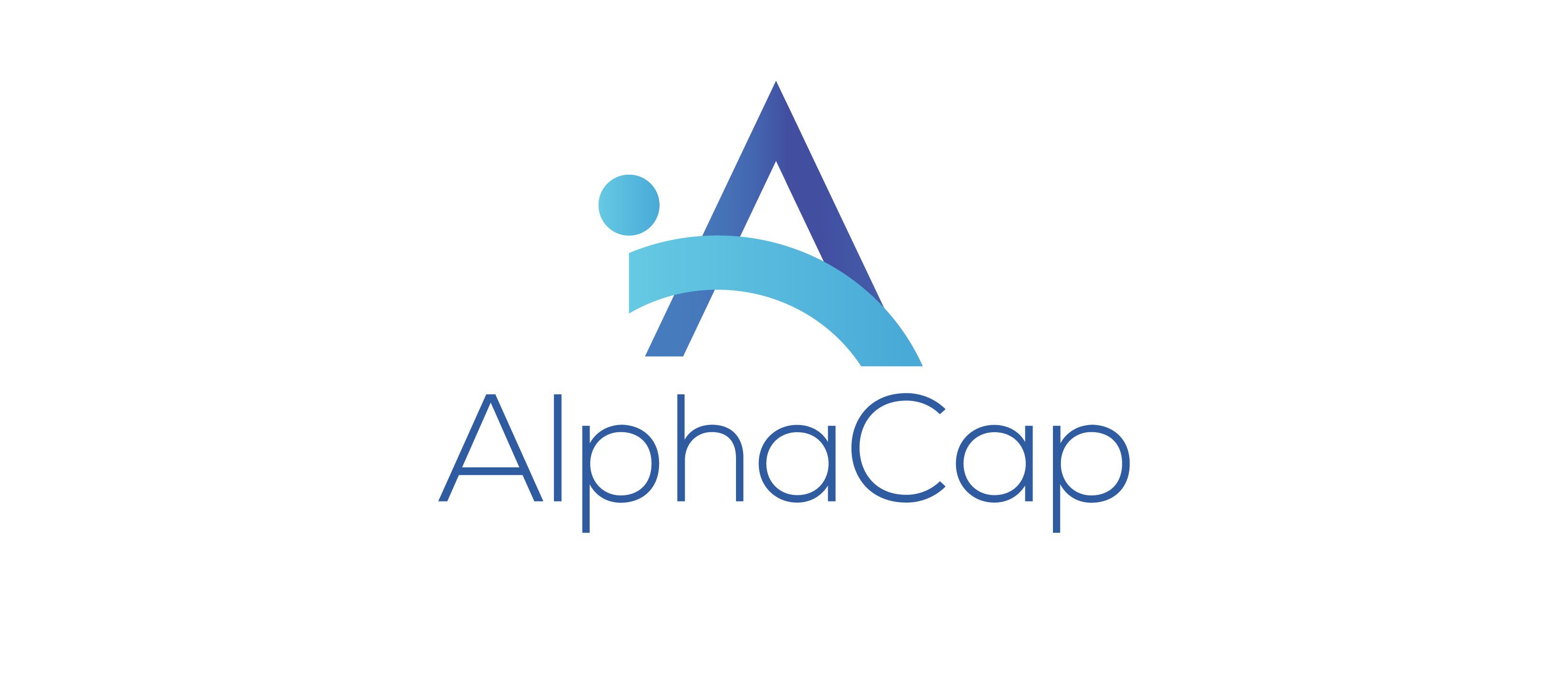
The Alphacap logo is a seamless fusion of an upward-curving arc,circle and an arrow, forming the shape of the letter ‘A.’ The arc embodies continuity, symbolizing reliability and unwavering dedication, while the arrow signifies forward momentum, commitment to excellence, and a drive to excel The circle reflects a commitment to customer centricity ,ensuring clients feel welcomed, heard, and valued within the consulting engagement.
With light blue and dark blue as its primary colors, the logo conveys trustworthiness, professionalism, and reliability. It effectively encapsulates the brand’s core values of simplicity, commitment, excellence, reliability, and innovation. The Alphacap brand is more than just a logo or a name; it embodies the essence of our organization. It matters because it acts as the cornerstone of perception, creating a lasting impression in the minds of our customers, partners, and stakeholders.
A strong brand serves as a compass, guiding decisions and shaping experiences. It unifies diverse offerings under a singular identity and narrative, fostering loyalty and trust. Brand matters because it’s a promise. It communicates values, quality, and consistency. In a world saturated with choices, a recognizable and reliable brand stands out, simplifying decision-making for customers. A well-crafted brand cultivates an emotional connection, making customers not just buyers, but advocates.
Internally, a well-defined brand aligns our teams and actions, driving a coherent vision. It steers marketing efforts, enabling targeted communication that resonates with intended audiences. Through a consistent brand, Alphacap then becomes a storyteller, sharing its journey, aspirations, and impact. In essence, our brand matters because it defines and amplifies Alphacap’s unique voice. It shapes perceptions, builds relationships,and adds value beyond products or services. A carefully nurtured brand lays the foundation for enduring success in a dynamic and interconnected marketplace.
These three symbols that informed our design process were: The Greek Symbol for An Arrow, An Arc and Circle
The Arrow >
The arrow’s direction indicates a straightforward path, signifying simplicity in our approach. The arrow’s unwavering direction showcases our dedication and steadfast commitment to our customers and partners. The arrow’s progression implies forward motion, reflecting our commitment to timely and reliable delivery.
The Arc (
The arc symbolizes the customer journey, from initial engagement to a successful outcome. It suggests a smooth and well-guided experience for AlphaCap’s clients. We viewed the Letter C as an arc and this formed the foundation of the arc as a Symbol.
The Circle
A single circular symbol artfully encapsulates the essence of consulting and customer-centricity. The silhouette, rendered in a varying gradient of light blue symbolizes collaboration and unity depicting people within its encompassing boundary. This people-centric design,characterizedby light blue gradienttones,emphasizes An approachable and inclusive atmosphere.This reflects a commitment to customer centricity ,ensuring clients feel welcomed, heard, and valued within the consulting engagement. In its simplicity, this single circular symbol conveys a nuanced message of collaborative consulting, customer-centric inclusivity, and balanced professionalism.

When combined, these symbols underscore AlphaCap’s commitment to scientific rigor, precision, accuracy, and expertise, highlighting the brand’s dominant values.
- The smooth, unbroken nature of the arc symbolizes a steadfast commitment to AlphaCap’s clients and partners. It suggests reliability and a promise to maintain a consistent course of action.
- The arc can be interpreted as a representation of evolutionary growth. It indicates that AlphaCap’s is adaptable and open to evolving to meet the ever-changing needs of its audience.
The Alphacap color palette was developed in a way that optimizes contrast, clarity, and alignment with the brand’s persona. The colors Dark Blue and Light Blue are intentionally blended to create a harmonious balance while catering to contrast, clarity, and emotive connections.
Dark blue, a deeper and more serious shade, is associated with professionalism, commitment, and a strong.
sense of responsibility. It conveys a message of authority, excellence, and dedication, perfectly aligning with the “We commit” and “We deliver” principles.
Light blue is often associated with a calm and tranquil feel. It is known to evoke feelings of trust, peace, and open-mindedness. These emotional responses align with the attributes of a reliable and accountable brand, fostering trust and a sense of dependability.